


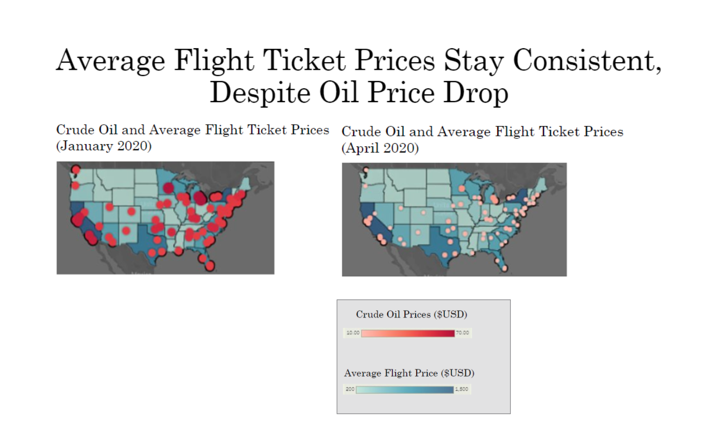
Visualizing COVID-19
github repo:
xsharonhe/cvt-scriptsreport to McKinsey & Co.:
google doc link hereThe Process
It was actually an interesting experience because I was one of the more experienced programmers on my team, as most of my teammates were science majors and wanted to get into research. However, working with them taught me a lot about how researchers and policy makers tackle similar problems from an analytical point of view. They taught me how to find valuable sources, how to collect this data, and how to come up with research questions.
Throughout this experience I was able to create a lot of graphs using mostly Seaborn, but there were someTableau dashboards, and it taught me a lot about how to analyze and how interesting data can be. You can
constantly continue analyzing data and find meaningful trends that can help shape business decisions.


Developed by Sharon He © 2023